ABOUT
In love with humans and technology, I'm weaving connections between their worlds through design.
I'm Carlo, a UX and Visual Designer currently based in Bologna, Italy.
My design journey began with graphic design, but my enduring fascination with human behavior led me to delve into the intricacies of economic history, particularly studying speculative bubbles.
During my master in behavioral economics, I had the opportunity to study decision-making processes and how they influence user choices.
To refine my skills in UX design, I completed a bootcamp, which led me to embark on this exciting career.
SKILLS
FIGMA

WEBFLOW

FRAMER
HTML

PROCREATE

PROTOPIE

SKETCH

RELUME AI

CLARITY

PHOTOSHOP

ADOBE XD

ILLUSTRATOR

INDESIGN

PREMIERE
PROJECTS
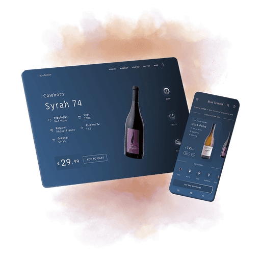
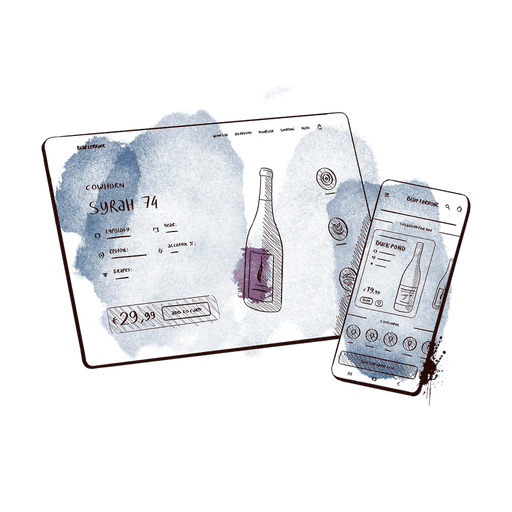
Blue Terroir is a wine e commerce that aims to deliver a selection of the finest wines right to the doorsteps of its customers.
I was responsible for designing the interface from scratch, including all atomic elements such as icons.
To meet the client's requirements, I made two options: the Lite option and the 'Devs Hell' one. They both have the same layout, but the Lite version lacks features and animations, which were difficult to integrate on Shopify.
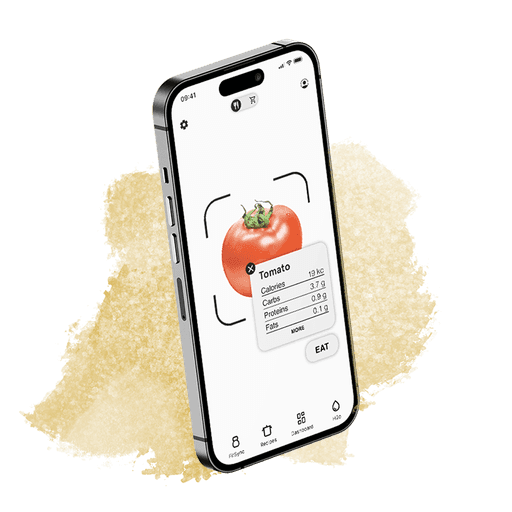
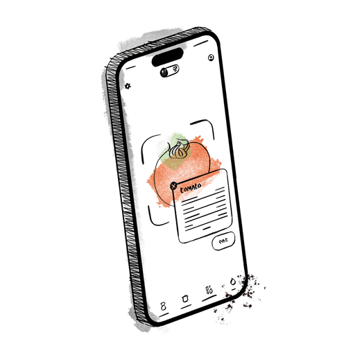
As part of an assignment to design a wellness app featuring a dashboard, I made Manjar, an augmented reality app to keep track of meals and much more.
Based on my user research, I recognized a gap in the market for an app that combines meal tracking with advanced AR features.
With features like tailored meal suggestions, real-time allergy alerts for better user safety, along with a grocery mode enabling users to quickly add products to their pantry, Manjar reflects its attributes of being lively, healthy, clean, and disruptive.
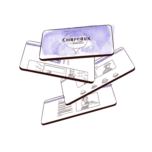
Chapeaux, an amazing Berlin-based hat store, didn't have an e-commerce platform to sell its items online.
Working with my team, I conducted interviews and competitive analysis to understand user needs. Our redesigned website showcases the store's handcrafted hats, along with a tool for customization.
We took an approach that kept our brand values intact while also fostering relationships with both new and existing customers.
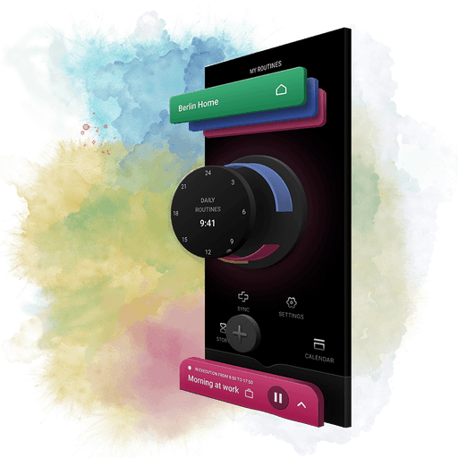
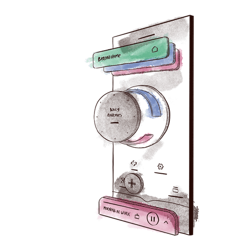
Bixby Routines is Samsung's virtual assistant that automates mobile routines.
The interface, while useful, has room for improvement. I decided to undertake a complete redesign to streamline user workflows and increase user enjoyment of the app.
The redesign made several changes to improve user engagement with the platform, including a complete visual refresh with a new logo, community-suggested routines, and a visual timeline.
